Kilnforming offers amazing opportunities to build more storage into your home, because you’ll need to stock frit and rod and billet and cullet and stringer and vitrigraph stringer. Plus, it should be stored where (a) you can easily see and reach it, (b) it doesn’t break and (c) it doesn’t kill you.
I’m thinking of this now because somebody asked me what I’d recommend to stock a new studio with an adequate supply of frit. My first impulse was to suggest that such a question was rather like asking which letters to buy for your laptop keyboard.
Then I got to thinking about it, and it really is a good question. Not sure it has an answer, but it’s still a good question.
For just Bullseye glass alone, you can purchase 412 different jars of frit. If I’m counting correctly, they produce frit in 103 of their glass colors. Each color comes in four sizes: powder (08), fine (01), medium (02) and coarse (03). Each frit size produces different textures, coverage, and sometimes colors, so it’s not really one-size-fits-all.
Add in Uroboros 90.0 Fusion frit, that’s another 235 jars. Even eliminating obvious duplicates (such as clear glass), you have around 625 possible frit choices. How do you figure out which of those to buy?
The obvious answer–it depends on what you want to do with it–doesn’t always help someone just starting out. I know it was something a friend and I agonized over when we hit up the glass store for the first time. We split the contents of ten frit jars between us: Black, marigold yellow, cobalt blue, cranberry, emerald green, grenadine red, white, peacock blue, plum, orange. It was mostly powder, with a smattering of fine and medium frit, primarily because that’s what the store had.
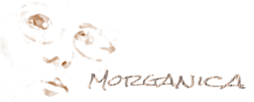
 In other words, we pretty much duplicated a small crayon box. I believe I used all of them on my very first kilnformed piece:
(Yeah, yeah, I’m sentimental. And it makes a great candy dish.)
If I’d known then what I know now–without considering casting supplies which is a whole ‘nother ball o’wax–I’d probably up the ante to 20 and pick these (and I’m trying to be as company-generic as possible on color names):
DISCLAIMER: This is MY list. I do a lot of painting and shading with frit, and to me these colors are the most useful for that. It’s mostly Bullseye because that’s the store nearest me, with the best selection, but I think there are probably analogs to many of these in other brands. I also do a lot of tack-fusing with medium and coarse frit, which isn’t really included here. And with a very few exceptions, these are opal (opaque) frits. Unless the color is extremely strong (as with Gold Purple and Cranberry), transparent frit is less effective for my purposes. It might not be for yours.
Neutrals
Amber powder: Incredible for warming up cold colors and toning down hot colors–this is probably my most all-purpose color and I use a LOT of it. I use it mostly for frit painting, but it’s also great as a field for some kinds of tack-fusing, and to give an aged or subtly shaded look to whites and creams.
Amber coarse: If you’re into tack-fusing, amber makes gorgeous, glittery golden nuggets. If you’re into full-fuse you can get a golden mottled effect that is extremely effective in frit-painting.
White powder: Invaluable for providing an opaque neutral underlayer when you want one transparent to pop out over another.
French Vanilla powder: French Vanilla is the queen of reactivity, which makes it a fun color to exploit. I personally think it makes a better black than black when mixed with Salmon Pink and/or Turquoise.
Woodland Brown: Ultimate shading tool, one I frequently use to tone down color when amber’s not strong enough.
Crystal Clear (powder, fine, coarse): I use so much of this stuff that I buy it in 40lb buckets. I prefer Crystal Clear because it keeps colors clearer, although that might be just my perception). The powder is great for reducing the intensity of a color without dulling it. The fine gives sparkle to tack-fuses and is needed for frit tinting. The coarse is a tack-fuse delight that gives you extra control over mottled color effects.
Black powder: I’m using pure black less and less; I prefer mixing my own from reactive powders and–at most–adding only a little to deepen the tone. But it’s still useful for sprinkling (extremely lightly) over pieces to give an aged, flyspeck appearance.
Warm colors
 Marigold Yellow powder. This is probably the single most versatile color I’ve ever worked with. Full-strength it’s a bright, hot orangey-yellow. But it mixes with Crystal Clear to make gorgeous jewel-toned saffrons and golds, and it starts doing really funky things mixed with other warms (and amber).
Some of the tints you can get with Marigold Yellow powder…
 Sienna powder. A newer Bullseye color, it’s both neutral and warm. Tack-fusing the powder in large quantities gives a really rich array of earthtones.
The marvelous versatility of a Sienna tackfuse…
Cranberry Pink powder. Ages ago, this was my favorite ruby tone. I’m less thrilled with it now–if you’re not careful it overwhelms just about anything you mix it with. Still it’s invaluable for enriching purples and warming up blues.
Orange Red powder. I choose this over a real red or orange because I like the scarlet tones, and it can go in a lot of directions when mixed.
Pimento Red. A yum color. Also fun to mix with and a great frit-tint option. Makes some lovely chocolate browns, too.
Cool colors
Deep Cobalt powder. You can get everything from sky blue to violet out of this color, depending on how it’s mixed. Very reliable.
Plum powder. This probably belongs in the neutrals because I rarely use it as a purple. It’s better than any grey for adding cool shadows, especially with light applications over white and other pale neutrals. It tends to give a slightly aged, somewhat darker tone to the color it sits over–it’ll warm cool tones and cool warm tones.
Neo-Lavender powder. This is the cooler, somewhat lighter complement to Plum as a shading tool. It slightly cools and “blues” anything I put it over, and is a lot less harsh than black or grey if you’re working with black tones.

NeoLav and Plum block in shadows and define shapes in a white-on-white (mostly) frit-painting…
Peacock Blue powder. I just have this in here because it’s a gorgeous color. I tend to use it in larger sizes, but it’s a good drawing powder as well.
Turquoise Blue powder. This opal is a marvelous reactive color, also a good drawing powder. In fact, I like using this as a base and putting Peacock Blue over for shading…makes some very subtle tints.
Spring Green powder. In the powder, I prefer the opal. But in larger frit sizes, this is quite possibly one of the prettiest transparent colors I’ve seen, and it is stunning with either Turquoise Blue or Peacock Blue. I’ve gotten a lot of mileage out of those combinations.
Olive Green. I like the smoky tones of this color, and it overlays the Spring Green very well. I tend to mix a lot of greens, adding NeoLav and Deep Cobalt to get the tones I need, and Olive Green makes a nice, rich base.
Gold Purple. Of all the shades in glass frit, I’m probably least happy with ready-made purples. But between Gold Purple, Plum, Cranberry and Cobalt, I can usually mix up exactly what I need. And Gold Purple powder makes a great “black” in cool compositions.

Variations possible with a mix of deep cobalt, gold purple and neolav…
And that’s 20. There are some I left off that would probably come next on my list: Marzipan (which has become my off-white of choice), Salmon Pink (the ultimate in reactive colors), Violet Striker, Grenadine Red, Egyptian Blue, Steel Blue. But if you eliminated casting and tack-fusing from my repertoire, I could probably do 80 percent of my current work with just those 20 colors.
Comments welcome! (thanks)