 Sometimes making the hard part easier makes other things much more difficult. These days I’m wondering if letting the glass manufacturer do all the work is really a good idea.
I think the biggest challenge of working with kilnformed glass is that you often take the final appearance of your work on faith, since the glass may change radically between cold assembly and the final firing. Sometimes colors react, sometimes textures change (as with coating-side-up irid), sometimes colors strike to new colors…and sometimes the glass simply reverts to its original color.
 Obviously, an artist working in this medium must understand and make allowances for that as they’re designing a new work. I’m finding, though, that even when I’ve tested and sampled and planned, at some point the creating gets spontaneous and I go from working to plan to working solely with the visuals in front of me. The plan suddenly seems confining, I have new ideas…and I start adding colors, textures, etc.
Sometimes it works. Sometimes it’s better than the plan. Lately, though, I’m thinking this stuff looks like circus clowns where I originally wanted cool contemplation, and I don’t like it.
The modeling medium (at least when I’m casting) has something to do with it. If you create in porcelain clay you’re working in a delicate silver monochrome and (for me at least) that influences the texture and shape. Adding color to all that grey can be an unwelcome jolt.
In other cases, though, prepackaged frits exacerbate the problem. When I was in France, we used crystal cullet for pate de verre, big honking chunks that we had to grind ourselves to make packable pate de verre powders. When you had the cullet right in front of you, it was far more difficult to envision anything but the real color while you worked.
Packaged powders seem to divorce my brain from the real thing and I start designing with the color I see, not the color I know it will be. I also get tempted by the kitchen sink syndrome with all those lovely frit jars right there behind me. (I’ve got a post on my studio layout if you want to see what I’m talking about)
OK, so blaming the frit-maker is a cop-out and no way would I *ever* give up Bullseye frit for cullet I ground myself. But apparently, until I get my colorsense under control again, I need all the help I can get.
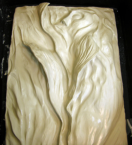
 Emerging 1 (below), another Emergents, is an example. I started out intending this for deep vermilions and cool blues and it’s a largish piece, about 12×18 inches. Here’s what I’d planned to do, color-wise:
Somewhere during the modeling process I fell in love with the porcelain effect and began exploring textures.
Too much rich color will confuse all the texture going on and I kinda like the serenity of the monochrome palette. So I’m sitting here, invested mold at the ready…and as usual I’m rethinking the plan.
 Maybe it’s time to pull back a bit. Maybe the joy I have working with frits and porcelains is a signal that bright, bright colors aren’t working for me. Maybe I need to get the forms right, close off the wild hues and just concentrate on getting the message across.
It’s what I’d tell clients–“too busy. let’s simplify.” It’s what I did in photography (move to black and white), and it helped immensely. Maybe it’s the way to take the next step in maturing as a glass artist.
So…I’m gonna do some five-finger exercises to get the color out of my system, and see where this takes me. Get thee behind me, frit jars!
P.S. (3/10/07): Thought I’d add a shot of the original inspiration for Emerging I as promised in my comment below. I’m obsessed with the lifecycle of tulips in my garden every spring, and pretty much the focus on my camera stops down to recording little bits and pieces of them until they’re gone. Here’s the image that started Emerging 1. You can see just how far the final model has gone…

As I have drawing and sculpture as my background,
I tend to think in lights and shadows. That happens when you make PdV mould in clay.
My fist attempts to glass sculpture I made in paraffin.
It has an opaque character
somewhat like PdV.
Working with fine frit has an
effect on color. If you wet it
you get one step closer to the final color.
-lauri
That’s a good idea, Havi–thanks! I may spend some time with this upside down and sideways and see where it takes me. It’s actually modeled on a picture I took of a dying tulip in my garden–I think I’ll post that so you can see what I’m talking about..and right now the tulip is very prominent in my mind, for all this is so abstract. Turning it upside down may help me see the real work better.
I hadn’t really thought about making this one transparent, probably because I tend to think in pate de verre terms. The “leaves” are actually curved and undercut into the investment–this is definitely a 1-time mold and persuading Bullseye glass to move into all the details would be tough. (Not impossible–but it’d be low-slow in the kiln at slumping temps for a very long time). OTOH, this might also make a good hot casting. Hadn’t thought of that, either.
So you’re opening my mind in many directions! Thanks, Havi…
–cynthia
You can also try and change the direction of the porcalain mold – like turn it upside down , in order to free yourself of what it looks to you now.
Remember what Kandisky said that an abstract painting no matter how you turn it – it will look good. [something similar]
However I like the mold a lot, and i like the colored glass, and i agree with your basic conception.
You may want to do on the mold one color of transparent glass and by slumping it deep into the curvices of the mold – you will get anyhow several tones of the same color.
And you may just turn the colored piece in different direction – and then find for it a separare design that will make this one good…….
I hope I made myself clear…….