Bullseye’s new product catalog is out, informative as ever but with my same old (minor) gripe, which I’ll get to inna minnit.
You can order the physical copy (or pick it up free in retail places, or I’d imagine they’ll send it to you with an order of glass). Or download it–it’s 12.3MB, so it might take awhile if you don’t have high-speed access.
I keep product specs for all the glasses I use in the studio–Bullseye, Uroboros 90, Gaffer casting crystal, Uroboros billet–where I can get at them easily. By the time the new literature comes out, I’ve usually got the old marked up with all sorts of firing notes, striking characteristics, viscosity observations, etc.
Of all the product literature, Bullseye’s is by far the most useful–they stick a LOT of stuff between those catalog covers, including coverage of favored artists and Bullseye events. So far I’ve identified a bunch of non-BE buddies in the new catalog’s photos–Richard, Emelia, Steve, Jane, Kari, Linda, Sondra, Alex, Carol and Catharine–and there are probably more if I look hard enough.
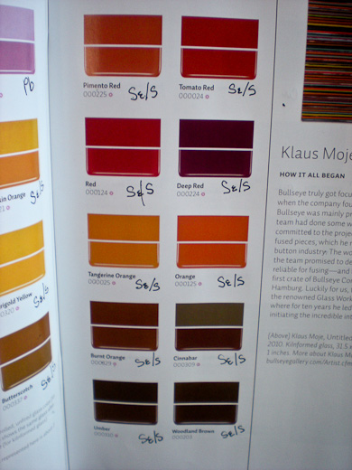
 But here’s what Bullseye DOESN’T stick between the covers, which means that every year I gotta get out my pen and add this by hand (right, in progress):
Those little scribbles flag the reactivity information for Bullseye glasses. It’s critical stuff to know if you’re mixing frit with any kind of glass.
Or at least it’s critical if you don’t want that beautiful pink whirly top on the new catalog cover, above, to become that beautiful mottled grey-and-pink whirly top because you tried to intensify it with a lovely red frit.
(Or whatever color(s) are in there. It looks like a lead-containing pink but despite more than fifteen years of using BE, I regularly miss. I am not one of those who can glance at somebody else’s sushi dish and say, “Ahhhh, I see you’ve layered 1827 over 0243.” It’s all I can do to remember that 1401 is the colorless one…)
Now, to be fair, all it takes is a few unexpected color reactions to engrain reactive colors on your brain. Basically, if it’s a beautiful cool crystalline blue, a lovely clear magenta-pink or -purple, a rich earthcolor with golden overtones, or a gloriously sunny hue, watch what you mix with it.
Bullseye does make this info available on their website and I salute them for it–if it’s available on other manufacturers’ sites I sure haven’t seen it.
Still, unless you have a computer in your studio, having reactive info on a website isn’t much help when you’re working. If I’m flying through a pate de verre pack, color isn’t always obvious, and I’ve got a bad habit of grabbing an unplanned powder and dumping it in BEFORE I remember that it will turn the whole concoction ick brown.
So I mark up one catalog with reactivity info, keep it close at hand, and guard it with my life. Studio visitors seem enchanted with that catalog and apparently disinclined to write all that stuff themselves. The markup catalog has been “borrowed.” Twice.
It’s not a huge deal, of course, a minor miss in what’s still the best in class. But I was kinda hoping that Bullseye would take several LARGE hints I dropped last year and just print in all those little Pbs, Ags and stuff for me.
Seems like an especially good deal to include it if some colors are especially meant to react with, say, copper or silver glasses. Maybe even add it to labels?
Wouldn’t take much–maybe put them on the right side under the image, on the same line as the color number.
IOW, about where I’m writing them now. Hint. Hint.
ADDENDUM: Our good friend Sunny from Spain forwarded this–it’s an image file of some of the key Bullseye reactive colors. He says we’re welcome to download it, print it out and tape it to a locker or something. Thanks, Sunny!

I vote yes, too.This would be soooo helpful for me. I had not thought of writing directly in the catalog. I write the symbols on the jars. Having them in the product book would be helpful but not just the chemicals, it should also list what it might react with the way it does onthe reactive part of the website.
If you don’t ask you don’t get, I always say. Maybe we should start a petition?
Not to make a big thing out of it, but if you’re going to sell glass designed to be reactive it just makes sense to make it easy to find th colors it reacts with. Right?
And put it on the website too. I don’t have a glass store near me and so I order online from Bullseye and buy at least one sheet of reactive ice with every order. Its no biggie to swap between web pages and look it up but why make it hard.
I was thinking the same thing when the new catalog came out!! I peeked at the pdf on the BE website, expecting to see the little colored squares with Cu, or Se on them (like in their tech notes), and was very disappointed they weren’t there! I thought, how hard can it be to add those little squares!
Yes, Marc. I have been using Bullseye’s new reactive colors (our local glass shop only recently started carrying them) and it does get confusing trying to understand which colors react and which do not.
In addition, I’ve found that some colors react very strongly (the color will not only darken next to the reactor glass but will spread out onto the reast of the reactive glass almost like a blast pattern). It’s quite beautiful but not all the reactor colors do this. Cynthia, you should ask Bullseye if there is some way to distinguish the strong reactors from the weak.
Truly I didn’t realize that other Bullseye colors can react too, until the store owner mentioned this. This is a whole new world to explore!
I like this idea because it would help you look out for mistakes. But what would also help is if if it said on the label not just what it had but will darken if used with glasses having Cu in them or what chemical is causing the problem.
BUt at least it should be in the catalog someplace. I don’t think a lot of people know about where it is on the bullseye web because I didn’t until I saw it in your article.
exxxxxxxackly! I’ve always wondered why that information wasn’t right on the lable in the first place. I bought the reactive cloudy glass and it would help if it showed which ones workwithout having to go find a puter. Its like you’ve supposed to have an ingredients list on food and paint so why not on glass? Its not likeit does not cost more,
(I catch your blog at least a copule times each week. its very helpful.)
mc
YES! Cynthia. I’ve got all kinds of crazy reaction lists I’ve compiled over the years. But DUH I was too dumb too simply write them in the catalog. And of course I keep losing them. It was a big help back when BE started the reactive rod list on the website. I’ve always loved reactions and use it for creating lines. So having a good reference helps me with my color possibilities.